Create Your Own Logo
Building Dreams: Unveiling the Architectural Masterpiece Within a Logo
Introduction
Architecture is a powerful form of art that shapes our world. Architectural spaces’ aesthetics, ambiance, and design can captivate and inspire people. A well-crafted logo is the starting point for any architectural firm, as it helps establish a strong brand identity and attract clients. In this blog, we will explore the essential components that contribute to the creation of a successful architecture logo, including elements, symbols, colors, typography, and more.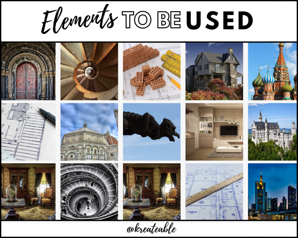
Important Components of an Architecture Logo
Understanding the Brand
Before designing a logo, it is crucial to understand your brand’s values, goals, target audience, and identity. Are you an architectural firm specializing in modern designs or classical structures? Understanding these aspects will guide you in creating a logo that represents your brand accurately and resonates with your target audience.
Elements and Symbols
a.Architectural Icons: Incorporate visually appealing symbols that represent the world of architecture, such as buildings, blueprints, drafting tools, or iconic architectural structures. These elements can infuse your logo with a sense of professionalism and expertise.
b.Geometric Shapes: Clean and precise geometric shapes, such as squares, triangles, or circles, can convey a sense of balance, harmony, and precision, which are essential aspects of architectural design.
Color Palette
Selecting the right colors for your architecture logo is crucial as colors have a psychological impact on viewers. Consider the following color themes:
a. Cool Blues and Grays: These colors evoke a sense of professionalism, stability, and trust, making them ideal for architecture logos. Shades of blue and gray can create a sense of calmness and reliability.
b. Earthy Tones: Incorporate earthy colors like browns, beiges, or greens to establish a connection with nature and sustainability. These colors can convey a sense of eco-friendly design and emphasize the use of natural materials.
c. Bold Accents: Add pops of bold colors, such as red, orange, or yellow, to create visual interest and highlight specific elements of your logo. These colors can represent energy, innovation, and a modern approach to architecture.
Typography
Choose typography that complements your architectural brand identity. Consider the following aspects when selecting fonts for your logo:
- Modern and Sleek Fonts: Clean, minimalist, and sans-serif fonts can convey a contemporary and sophisticated image. Architectural firms often favor these fonts with a focus on modern design.
- Classic and Timeless Fonts: Serif fonts or calligraphic scripts can add a touch of elegance and timelessness to your logo, making them suitable for firms specializing in classical or traditional architecture.
- Custom Fonts: Consider creating a custom font or modifying an existing one to give your logo a unique and distinctive look. Custom typography can help reinforce your brand’s identity and make your logo stand out.
Size
When designing your architecture logo, consider its scalability and legibility across various mediums. Ensure that your logo remains clear and recognizable when scaled up for signage or down for digital use, such as website icons or social media profiles.
Design
The design of an architectural logo should be visually captivating and reflect the essence of your brand. Consider the following design elements:
a. Simplicity: Keep your logo design clean, minimal, and uncluttered to convey a sense of professionalism and elegance. Avoid overcrowding your logo with unnecessary details.
b. Structural Elements: Incorporate architectural symbols or elements that represent your specific area of expertise, such as arches, columns, or iconic building profiles. These elements can help communicate your firm’s specialization and expertise.
c. Balance and Proportion: Ensure that your logo design maintains a sense of balance and proportion. Harmonious compositions can create a visually pleasing and memorable logo.
Brand Identity and Storytelling
A successful architecture logo should not only represent your brand but also tell a compelling story. Incorporate elements that reflect your firm’s values, unique selling points, or architectural philosophy. By aligning your logo with your brand story, you can establish a meaningful connection with your target audience.
Versatility
Ensure that your architecture logo is versatile and adaptable across various mediums and platforms. Test its effectiveness in both color and black-and-white formats. Your logo should work well on different materials, such as stationery, signage, or promotional materials while remaining visually appealing and recognizable.
Research and Inspiration
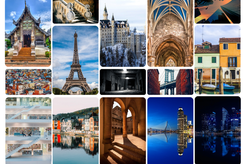
Conduct in-depth research and seek inspiration from successful architectural firms, both locally and globally. Analyze their logos to understand design elements that resonate with your brand and target audience. Create a collection of images to help visualize your logo ideas and explore different design directions.
Customization and Uniqueness
Aim for a logo that stands out in the competitive architectural market. Avoid generic or overused design elements that may dilute your brand’s uniqueness. Invest in a custom design or collaborate with a professional graphic designer to ensure originality and create an impactful logo.
Test and Refine
Gather feedback from trusted colleagues, clients, or potential customers to gain insights and refine your logo design. Be open to constructive criticism and make necessary adjustments to create the most effective logo for your architectural firm.
Protect Your Logo
Once you have finalized your architecture logo, consider legally protecting it by trademarking. This step safeguards your logo from unauthorized use and strengthens your brand’s identity and uniqueness.
Logo Styles And Trends
a. Modern and Minimalist: Embrace sleek lines, clean shapes, and minimalist typography to create a logo with a contemporary and sophisticated look. These logos convey a sense of professionalism and a modern approach to architecture.
b. Geometric Abstractions: Experiment with abstract geometric shapes and compositions to create visually striking and unique logos. Geometric abstractions can represent architectural concepts, creativity, and innovation.
c. Architectural Sketches: Incorporate hand-drawn sketches or illustrations of buildings, structures, or architectural elements to add an artistic and personal touch to your logo. This style can emphasize your firm’s craftsmanship and attention to detail.
Some Famous Architectural Logo Ideas
Foster + Partners: Foster + Partners is a globally renowned architectural firm known for its innovative and sustainable designs. Their logo features a simple, sleek, and minimalist approach. The typography is clean and modern, with the company name in lowercase letters. The “+” sign between “Foster” and “Partners” symbolizes collaboration and partnership, reflecting their collaborative design process.

Reference: fosterandpartners.com
Zaha Hadid Architects: Zaha Hadid Architects is known for its avant-garde and futuristic designs. Their logo reflects their distinctive style with its fluid and dynamic form. It features an abstract geometric shape that resembles an architectural structure, expressing movement and innovation. The logo uses a bold and modern font, capturing the firm’s progressive approach to architecture.

Reference: zaha-hadid.com
Bjarke Ingels Group (BIG): BIG is an architectural firm led by Bjarke Ingels, known for its innovative and sustainable projects. Their logo showcases a bold and contemporary design. It features the firm’s acronym “BIG” in uppercase letters, with each letter creatively designed to resemble a building block. The logo reflects their approach of creating architecture that is playful, functional, and socially responsible.
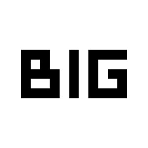
Reference: big.dk
Skidmore, Owings & Merrill (SOM): SOM is one of the largest and most influential architectural firms in the world. Their logo represents a timeless and classic style. It features the firm’s initials “SOM” in a strong, serif font, conveying a sense of tradition and stability. The logo’s simplicity and elegance reflect their focus on creating enduring and iconic architectural designs.

Reference: som.com
Conclusion
Designing an exceptional architectural logo requires creativity, research, and a deep understanding of your brand identity. By exploring various concepts, colors, typography, elements, and symbols, you can create a captivating logo that represents your architectural firm effectively. Whether you are an architect seeking inspiration or a designer creating a logo, these architectural logo concepts and ideas will guide you on an inspiring design journey filled with elegance and innovation.