Introduction
Law is a language of justice for many, transcending borders and cultures. It’s a cornerstone of society, essential for upholding order and ensuring fairness. When people seek legal counsel, they’re not just looking for advice; they’re looking for trust and reliability. Establishing that trust begins with a compelling logo that conveys the essence of a law firm. In the world of legal services, a well-crafted and visually resonant logo can forge connections and attract clients, contributing to the firm’s recognition. A law firm logo should exude professionalism and evoke a sense of authority, integrity, and expertise. This blog explores key elements needed to design a captivating law firm logo, including symbolism, color psychology, typography, and more.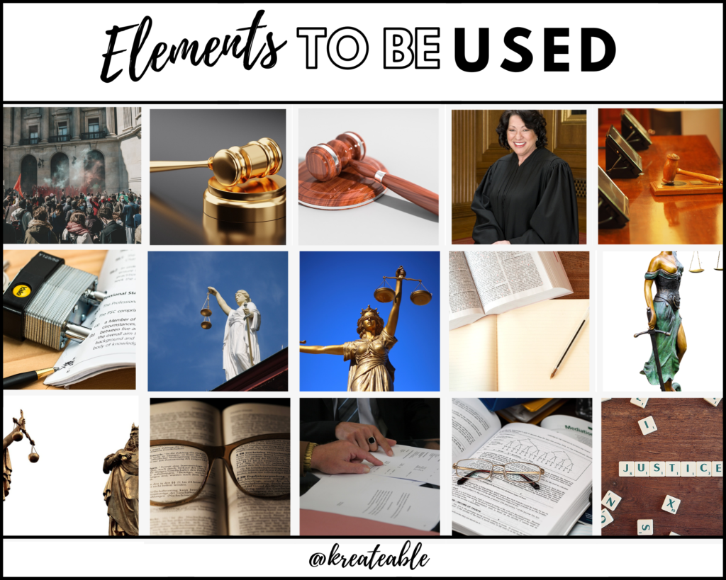
Essential Elements of a Law Firm Logo
Understanding the Brand
Grasping the Firm’s Identity: Before diving into logo design, delve into your firm’s values, specialization, target clients, and reputation. Are you a boutique law firm focused on family law, or a global firm dealing with corporate affairs? Clarifying your firm’s identity is crucial for a logo that speaks volumes about your brand and resonates with your audience.
Elements and Symbols
a. Balanced Scales: A classic symbol of justice, balanced scales represent equity and fairness.
b. Columns or Pillars: Often associated with the strength and solidity of legal institutions.
c. Gavel: A gavel symbolizes authority and decision-making.
Color Palette
Color choices in a law firm logo can influence perception. Opt for colors that communicate professionalism, trust, and credibility.
a. Deep Blues: Representing authority and stability, deep blues are a common choice.
b. Regal Gold: Gold signifies wealth, success, and high standards.
c. Subtle Grays: Grays suggest sophistication, neutrality, and balance.
Typography
Selecting the right font is pivotal. Consider your firm’s personality and specialization.
a. Serif Fonts: Classic and formal, serif fonts evoke tradition and professionalism.
b. Sans-serif Fonts: Clean and modern, sans-serif fonts convey clarity and simplicity.
Scalability and Versatility
A law firm logo should be adaptable to various mediums. Ensure it’s legible when scaled down for business cards, yet impactful when displayed on billboards.
Design Approach
Simplicity is key in law firm logos. Strive for a design that’s clean, streamlined, and carries the essence of the firm’s values. Avoid unnecessary complexity to ensure easy recognition.
Brand Identity and Storytelling
A law firm logo should encapsulate not only your firm’s expertise but also its history and values. Incorporate elements that highlight your areas of specialization, such as a subtle incorporation of a gavel or a stylized courthouse column.
Versatility
Your logo should be versatile across print and digital media, in both color and grayscale. It should maintain its impact when scaled for online profiles and letterheads alike.

Test and Refine
Seek feedback from peers, colleagues, and even potential clients to refine your logo. Constructive criticism can help polish the logo to perfection.
Legal Protection
Once your law firm logo is finalized, consider trademarking it to safeguard your brand’s identity and prevent unauthorized use.
Logo Styles And Trends
a. Classic Elegance: Employ traditional elements like columns, balanced scales, and serif fonts for a timeless and authoritative look.
b. Modern Minimalism: Streamlined designs with sharp lines and contemporary fonts convey professionalism and innovation.
c. Emblematic Crests: Use crests or shields to showcase your firm’s history and specialization.
Examples of Famous Law Firm Logos
Skadden, Arps, Slate, Meagher & Flom
Logo Description: Skadden’s logo is known for its clean and minimalist approach. It consists of the firm’s name in bold, uppercase letters. The unique feature is the stylized “S” in the logo, with the curve of the “S” connecting to the top of the “A,” creating a distinctive visual element.
Elements: The primary element of the logo is the firm’s name itself, with emphasis on the stylized “S.” The simplicity of the design exudes professionalism and modernity.
Colors: The logo predominantly uses a deep blue color, which signifies trust, confidence, and stability in the legal world. The blue color choice aligns with the firm’s commitment to professionalism and expertise.
Fonts: The font used in the logo is a modern and bold sans-serif typeface. The uppercase letters project a sense of strength and authority, while the clean lines of the font maintain a contemporary feel.
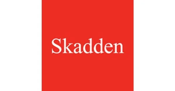
Reference: www.skadden.com
Baker McKenzie
Logo Description: Baker McKenzie’s logo is distinctive for its circular emblem containing a world map. The firm’s name encircles the emblem, creating a harmonious balance.
Elements: The central element of the logo is the globe emblem, which represents the firm’s global reach and expertise in international law. The encircling of the firm’s name adds a sense of unity and interconnectedness.
Colors: The logo employs a deep blue color for the globe and typography. The blue symbolizes trust, integrity, and professionalism, while the hint of gold in the emblem adds a touch of prestige and excellence.
Fonts: The firm’s name is presented in a classic serif font. The timeless nature of serif fonts aligns with the firm’s long-standing reputation and commitment to tradition.
Reference: www.bakermckenzie.com
Latham & Watkins
Logo Description: Latham & Watkins’ logo is characterized by its strong and bold typography. The firm’s name is the central focus, creating a sense of authority and confidence.
Elements: The logo’s primary element is the firm’s name, placed in a straightforward horizontal arrangement. The emphasis on typography underscores the firm’s reputation and expertise.
Colors: The logo predominantly uses a dark blue color, communicating professionalism, trustworthiness, and expertise. The monochromatic palette keeps the design sleek and impactful.
Fonts: The firm’s name is presented in a clean and modern sans-serif font. The bold typeface communicates strength and a contemporary approach, while the clarity of the font underscores the firm’s transparency and clarity in legal matters.
These descriptions highlight how these famous law firm logos incorporate key design elements, color psychology, and typography to convey their brand identity and values. Each logo has a unique approach that aligns with the firm’s reputation, professionalism, and commitment to excellence in the legal field.
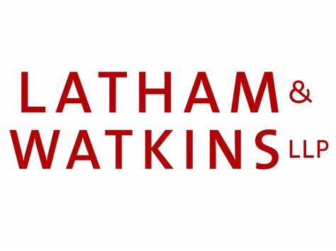
Reference: www.lw.com
Conclusion
Creating an impactful consultant logo demands a fusion of creativity, strategy, and a deep understanding of your consultancy’s identity. By embracing diverse concepts, color palettes, designs, typography, and symbolism, you can craft a consultant logo that captures attention, resonates with your audience, and sets the stage for your consultancy’s success. Whether you’re a seasoned consultant seeking to refresh your brand or an aspiring consultant venturing into the field, these concepts will guide you on a remarkable and purposeful design journey. Just as a well-crafted logo leaves a lasting impression, so too can your consultancy’s expertise leave an indelible mark on the world.