Introduction
Churches hold a special place in the hearts of many, offering spiritual nourishment and a sense of community. Just as food is a universal language, the symbolism, and spirituality associated with churches are deeply meaningful. A church’s visual identity begins with its logo, which plays a vital role in conveying its values and attracting congregants. In this blog, we will delve into the essential elements required to create an impactful church logo, encompassing symbolism, colors, typography, and more.
Key Elements of a Church Logo
Embracing the Essence
Before sketching a logo, it’s imperative to grasp the core values, mission, congregation, and identity of the church. Are you a traditional sanctuary or a modern community hub? Understanding these nuances will guide your logo’s design, making it a true representation of your faith community.
Symbolic Elements
a. Spiritual Imagery – Incorporating meaningful symbols like crosses, doves, bibles, or church architecture can evoke a sense of reverence and devotion.
b. Typography – Selecting a font style that exudes solemnity and clarity is crucial. Traditional script fonts might suit a more formal denomination, while contemporary fonts could resonate with a progressive congregation.
c. Nature’s Serenity – Integrating elements from nature, such as vines, leaves, or sunbursts, can symbolize growth, renewal, and the divine connection to the Earth.
Harmonious Color Palette
The choice of colors in a church logo profoundly impacts the message it conveys.
a. Sacred Hues – Deep blues, purples, and rich gold can evoke feelings of spirituality, loyalty, and majesty.
b. Tranquil Tones – Soft greens and serene blues offer a sense of peace, harmony, and hope.
c. Timeless Neutrals – Earthy tones like browns and grays bring a grounding sense of stability and tradition.
Fonts with Faith
a. Traditional Elegance – Classic serif fonts can evoke a sense of timelessness and reverence.
b. Modern Grace – Clean and contemporary sans-serif fonts may symbolize a progressive and welcoming atmosphere.
Adaptable Size
A church logo should maintain legibility across various applications, from letterheads to digital banners. It should remain recognizable and coherent, whether it’s displayed on a church sign, website, or social media profile.
Inspired Design
A church logo’s design should encapsulate the heart of your faith community. Incorporating church-specific visuals such as steeples, crosses, or open Bibles can create a connection between your logo and the spiritual essence you wish to convey.
Spiritual Storytelling
More than just an emblem, a church logo should narrate a compelling story about your congregation’s journey, values, and mission. Every element should reflect a meaningful facet of your faith and establish a strong emotional bond with your congregation.
Versatility
A successful church logo should be adaptable to various formats and platforms, both print and digital. Ensure it remains impactful and recognizable even in black-and-white renditions or when scaled down for social media icons.
Seek Inspiration
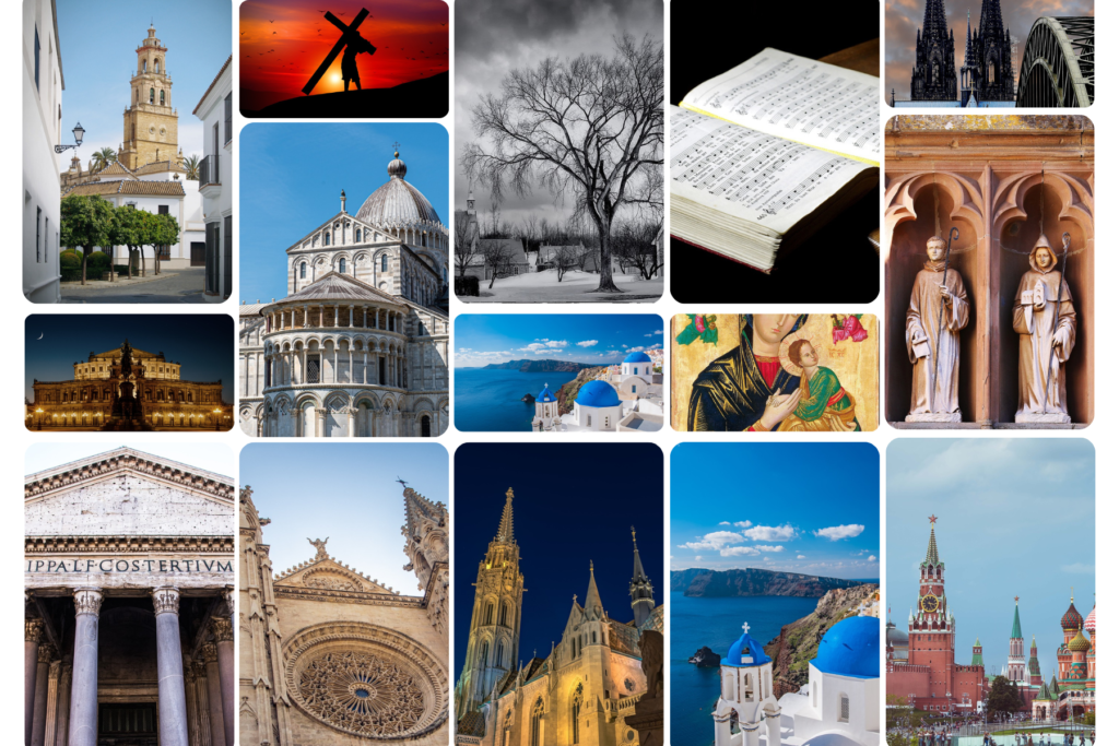
Delve into the logos of renowned churches worldwide to gain inspiration. Analyze their design elements, color palettes, and symbolism to help shape your own distinctive logo.
Unique Identity
To stand out in the realm of religious symbolism, aim for a logo that is unique to your congregation. Avoid clichés and instead focus on encapsulating your church’s individuality.
Test and Refine
Solicit feedback from your congregation and peers. Their insights can guide you in refining your logo, ensuring it resonates with your community’s spirit and values.
Preserve Your Emblem
Once you’ve finalized your emblem, consider legal protection like trademarking to safeguard your logo’s integrity and uniqueness.
Logo Styles And Trends
a. Traditional Reverence: Time-honored design styles exude reverence through intricate typography, stained glass motifs, and classic symbols.
b. Contemporary Grace: Modern aesthetics featuring clean lines, minimalist symbols, and elegant typography, reflecting a forward-thinking and inclusive church.
c. Inspirational Artistry: Incorporating hand-drawn elements, calligraphy, or watercolor touches to convey the church’s artisanal and nurturing spirit.
Examples of Famous Finance Logos
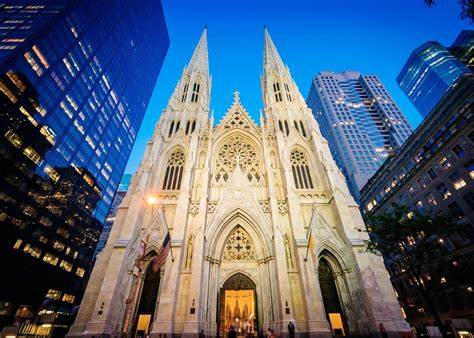
St. Patrick’s Cathedral, New York
Elements: St. Patrick’s Cathedral, an iconic landmark in New York City, incorporates its architectural features into its logo. The twin spires of the cathedral are represented with subtle lines, and the cross on top of the spire is prominently featured.
Font: The font used in the logo is classic and dignified, resembling traditional calligraphy. The choice of font reflects the cathedral’s historical significance and adds a touch of elegance to the emblem.
Colors: The logo employs a color palette that is often associated with spirituality and reverence. Deep blues and rich golds are used to evoke a sense of grandeur and spiritual significance, echoing the cathedral’s status as a historical and spiritual monument.
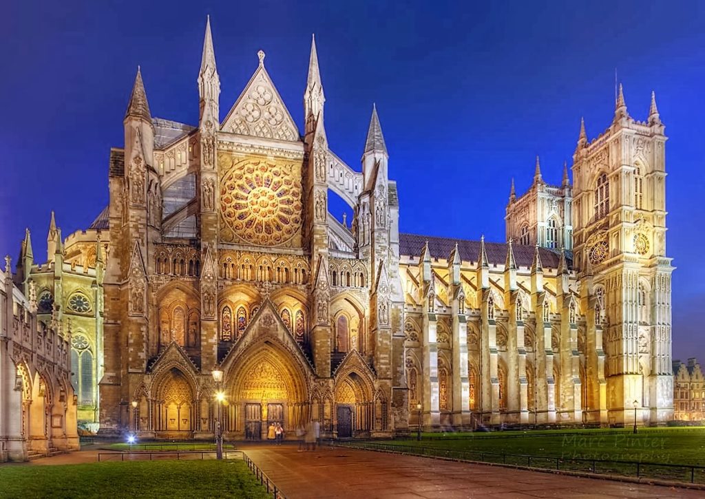
Westminster Abbey, London
Elements: The logo of Westminster Abbey features a simple and iconic depiction of the abbey’s architectural silhouette, emphasizing its central cross. The overall design is clean and streamlined.
Font: The font chosen for the logo is traditional and elegant, reminiscent of classic calligraphy. The careful spacing and curvature of the letters evoke a sense of tradition and historical reverence.
Colors: The logo employs a restrained color palette, using black and white to create a timeless and sophisticated appearance. This choice complements the abbey’s historical significance and the austere beauty of its architecture.
Hillsong Church
Elements: The Hillsong Church logo is characterized by its simplicity and modern aesthetics. The emblem consists of a stylized letter “H” enclosed within a circle, symbolizing the unity and inclusivity of the congregation.
Font: The font used in the logo is contemporary and bold, reflecting the dynamic and vibrant nature of the church. The clean lines and sans-serif style contribute to a sense of modernity.
Colors: The logo employs a minimalistic color palette, primarily using black and white. This simplicity emphasizes the symbol’s clarity and versatility, making it easily adaptable across various mediums and applications.

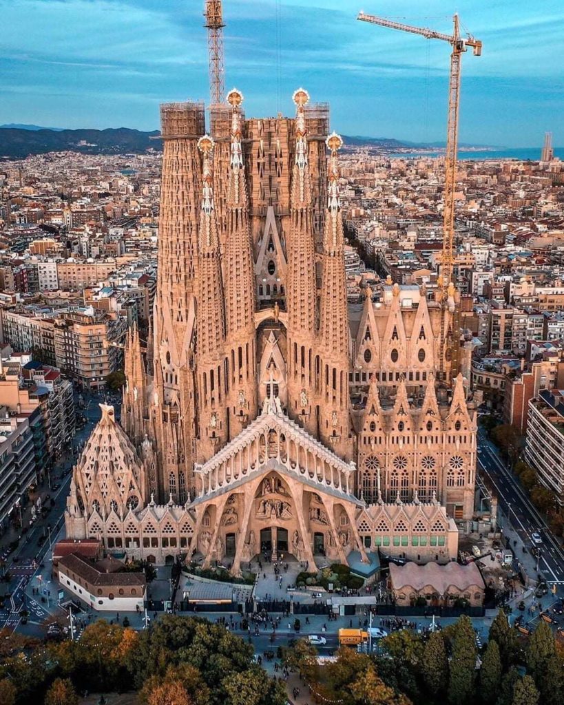
Basilica of the Sagrada Familia, Barcelona
Elements: The logo of the Basilica of the Sagrada Familia uniquely captures the basilica’s distinctive architecture. It incorporates the basilica’s iconic spires and intricate facades, capturing the essence of the building.
Font: The font used in the logo is simple and unobtrusive, allowing the architectural elements to take center stage. The font’s clean lines complement the complexity of the basilica’s design.
Colors: The logo employs a muted color palette, predominantly using shades of brown and beige. These earthy tones reflect the natural materials used in the basilica’s construction and emphasize its connection to the environment.
These notable church logos showcase a range of design approaches, from classic and traditional to modern and minimalist. Each logo’s elements, fonts, and colors are carefully chosen to convey the church’s values, history, and spiritual significance, creating a visual identity that resonates with both congregants and visitors.
Conclusion
Designing a compelling church logo necessitates a blend of creativity, faith, research, and a deep understanding of your congregation’s essence. By weaving together symbolism, color psychology, typography, and design principles, you can create a captivating logo that resonates with both established members and newcomers. Whether you’re a religious leader seeking a logo for your congregation or a designer inspired by divine aesthetics, these concepts and ideas will guide you on a sacred journey of logo design.